Services
Rebrand
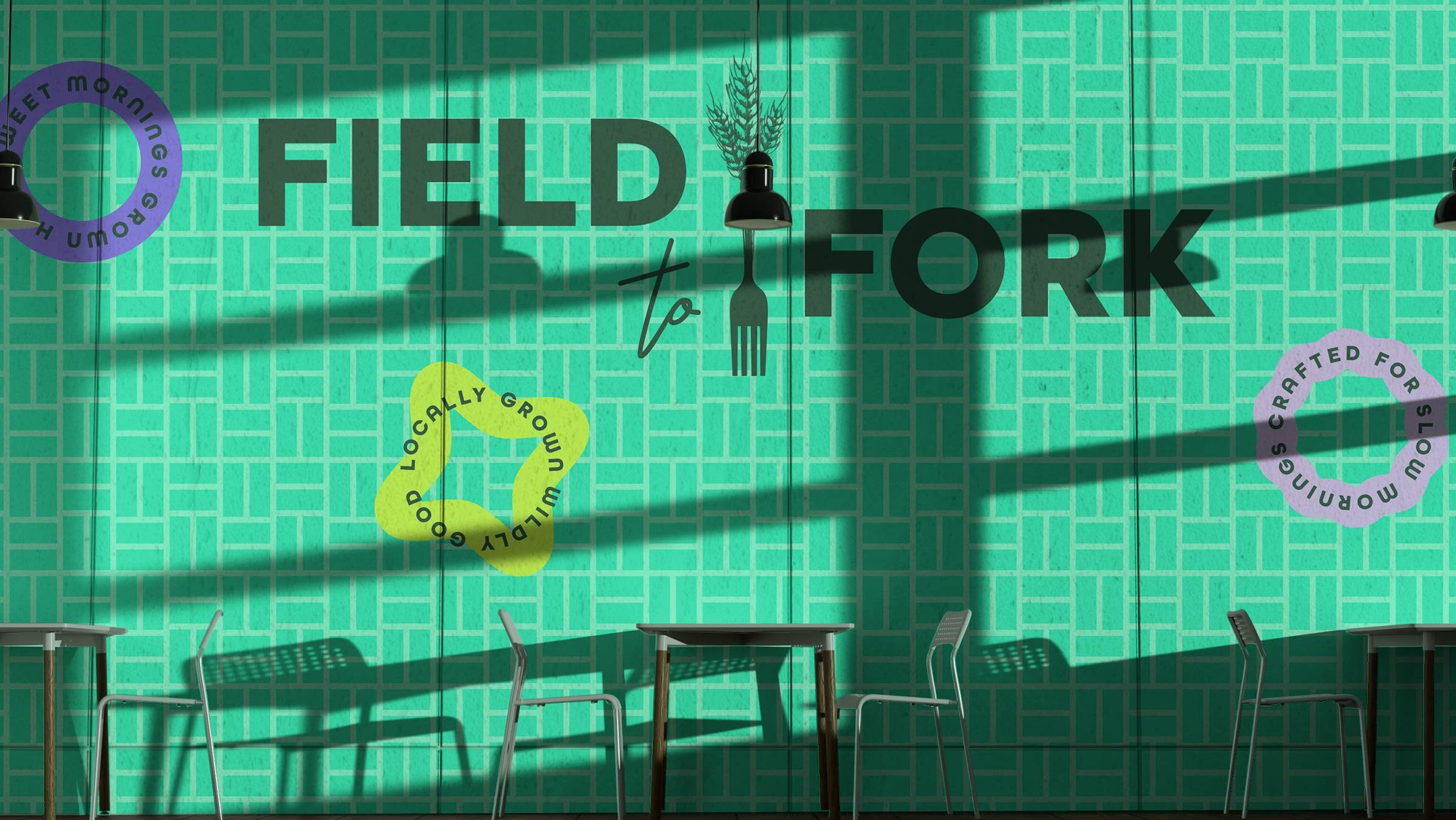
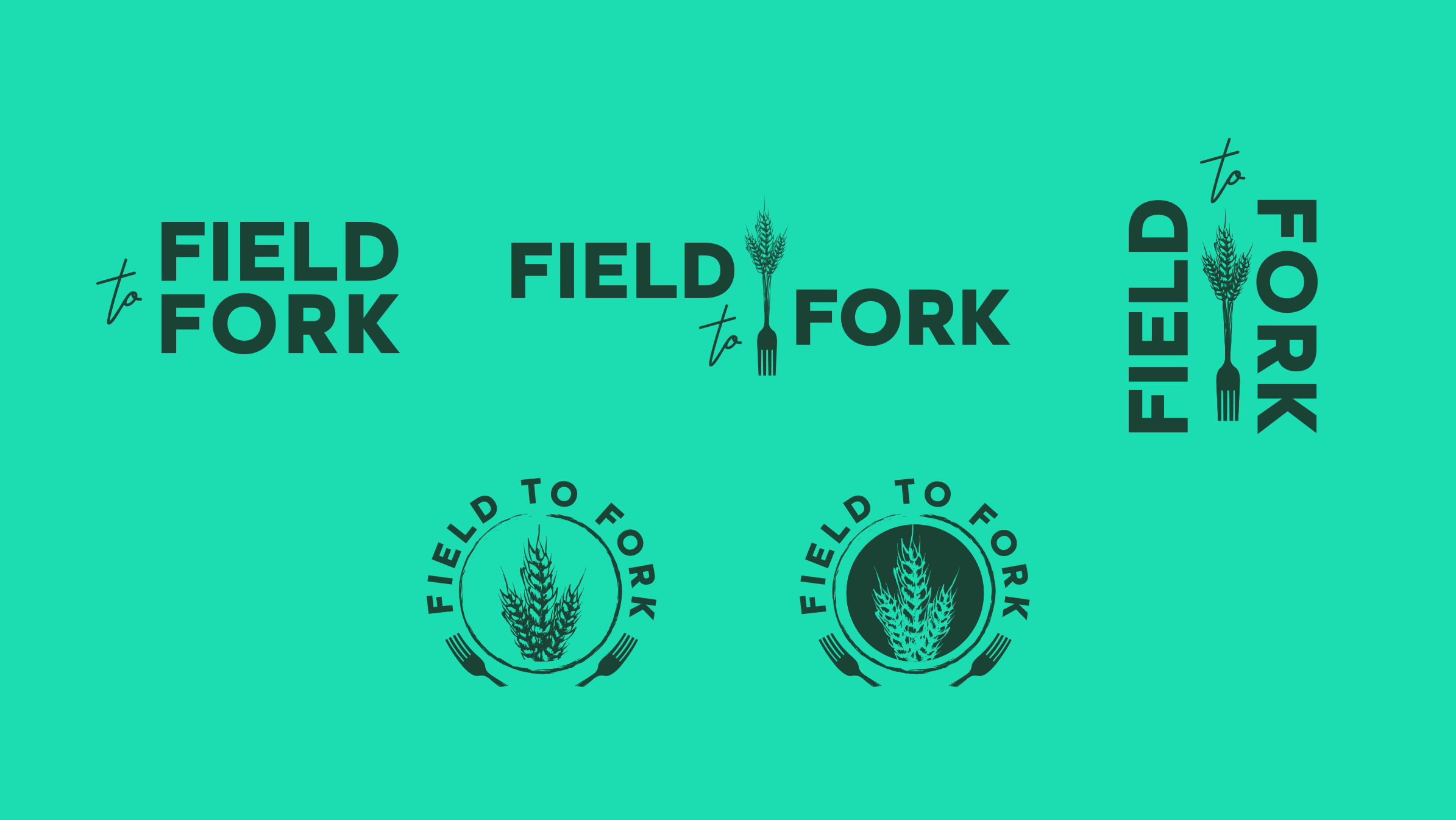
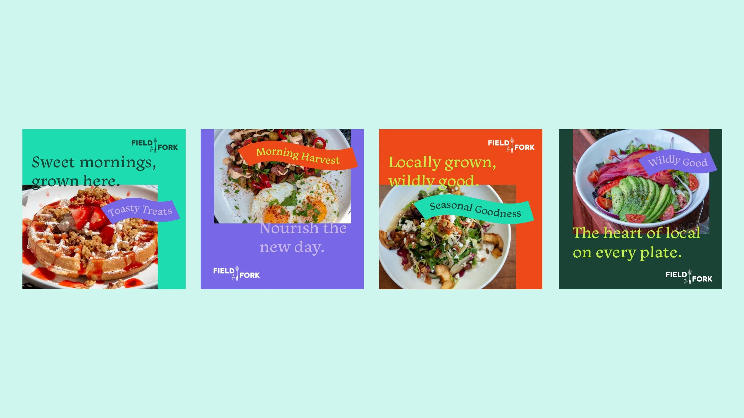
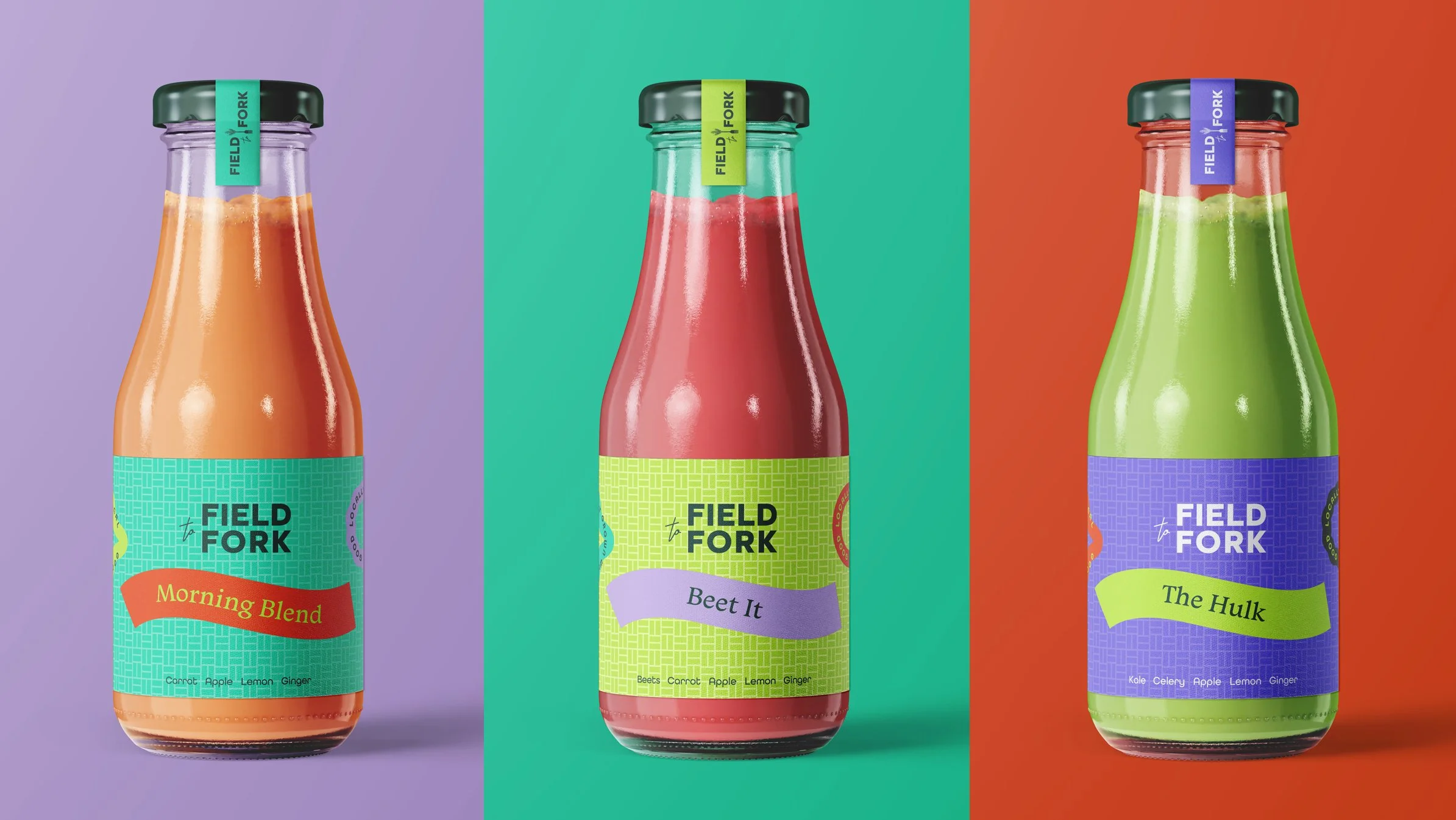
Field To Fork
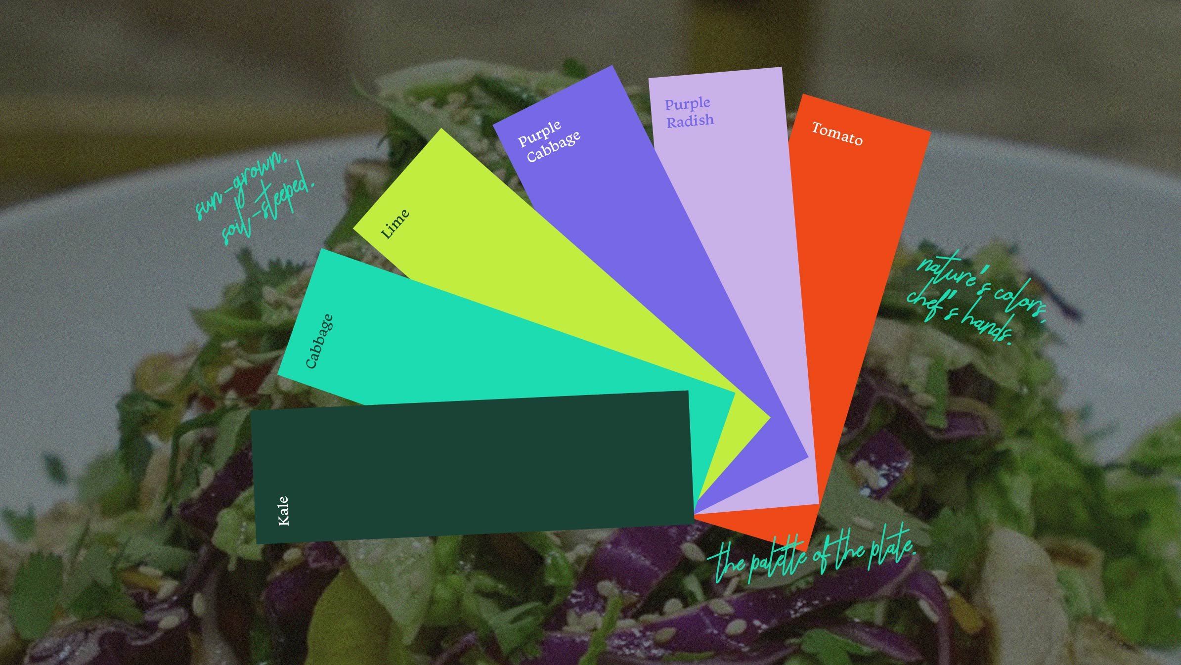
Field to Fork, a Sheboygan staple, came to us ready for change. With a new focus solely on their restaurant, they were looking to modernize their logo into something fresh and approachable that still honored who they’ve always been. The iconic fork and wheat remained, reimagined with a more modern, refined style. The palette took a bold new turn, inspired by produce and designed to bring vibrancy and warmth that matches the energy of their café.
The identity reflects their deep connection to local farmers and makers, as well as the spirit of their in-house Bakery, Butcher Shop, Coffee Roastery, and Juice Bar. While the concept was never implemented, it remains a proud reflection of thoughtful exploration and a vibrant step forward in their evolving story.